One of the most common shortcomings in the works of artists today is poor drawing ability. There is a perception among some, especially if working in the highly symbolic styles of the gothic, the iconographic or even the style featured recently, the Beuronese style, that the artist can hide his lack of technical skill behind the stylistic elements. I have heard people say that they signed up for icon painting classes for example, because they think that they don’t need to be so good at drawing.
The same thing happens in mainstream arts schools, students opt for Expressionistic styles because they know that they can’t be held to account for how bad the drawing is – they can hide the lack of skill behind wild and flamboyant brush strokes. Many just forgo the paintbrush altogether, pick up a video camera and go for conceptual art.
This may be acceptable in the context of 20th century art styles, but I suggest this is not good enough for sacred art, no matter what style we want to work in.
In fact it is more difficult to work within a particular tradition and retain accuracy in drawing. It requires the artist to understand both where he must be precise in reflecting nature, and where he must be precise in deviating from natural appearances in accordance with the demands of the style of the tradition.
Artists quite often show me their work and one of the usual comments I make is, you need to improve your drawing. It is great that there are more and more people who are looking to traditional forms as inspiration for sacred art and so I always want to be encouraging. There is hope, drawing is a skill that can be taught. Someone who wants to learn to draw can spend time learning the academic method of drawing – this trains the eye to observe nature and then to render it in two dimensions. Another thing to consider is an illustrators’ course, in which one can learn how to create new images without always having to set up a tableau of figures posing for the image. At some point the good artist does need to be able to go beyond simply drawing what he can see. He must be able to draw what is in his imagination too.
Here are two examples of faults that I often see. I don’t like highlighting what is bad in other peoples’ work, so I’ll use examples of mine to illustrate (I have plenty to choose from!)
The first is the drapery of cloth. In sacred art, the figures are often portrayed with draped clothing. It is vital that the folds in the cloth look natural and that there is a sense of a properly proportioned figure underneath. The only way to understand this that I know is to study how material drapes over the human form. One of my frustrations when I was studying academic art was that we spent so much time studying the nude, but none devoted to studying clothes. This would have helped me.
Have a look at this painting of St Silouan the Athonite. At first glance, the folds in the cloth look natural, but if you look closer you can see that the deep red robe is done incorrectly in the region between the arms. The reason is that I didn’t really understand what I was supposed to be painting and so just guessed.
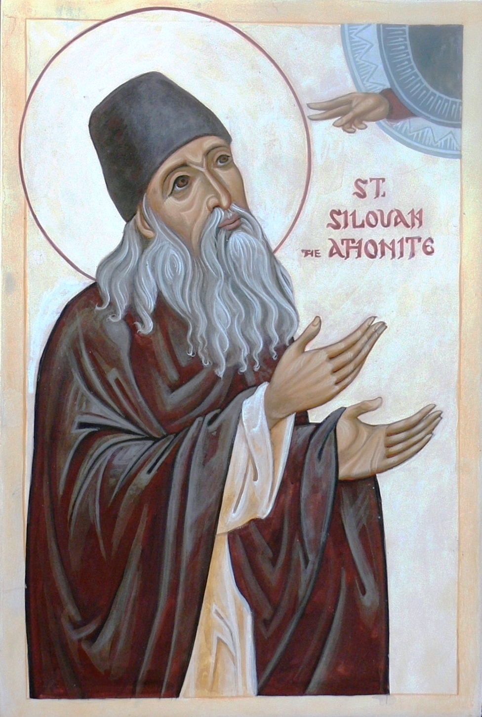
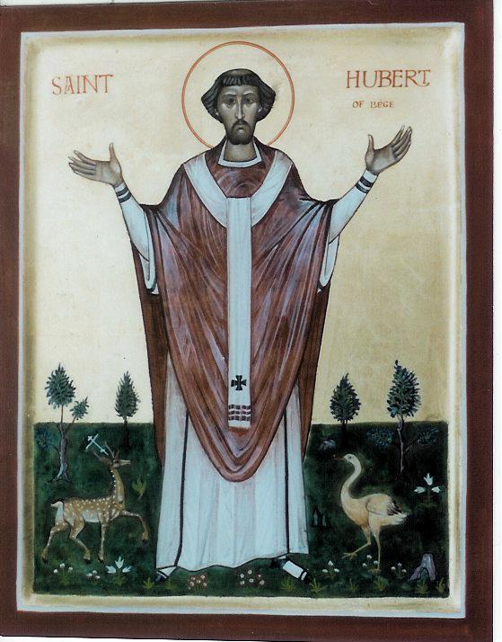
In fact, it the red robe should have been doing what St Hubert’s is below (in Aidan Hart’s icon), hanging in a U shape between the arms.
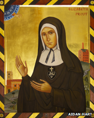
and then the figure is rotated for a three quarter profile view as in this figure of Elizabeth Prout shown below. Aidan Hart has shown it with the line drawing in black on a plain brown robe rendered without additional shading or highlights.
If we want the figure to look natural underneath the drapery then there are certain pressure points at which the clothing is supported by the figure or otherwise directly acted upon by the figure, while else where it hangs free. This will usually be places such as the shoulders, elbows, knees and the crook in the elbow. If these pressure points are not place absolutely precisely the whole figure looks wrong.
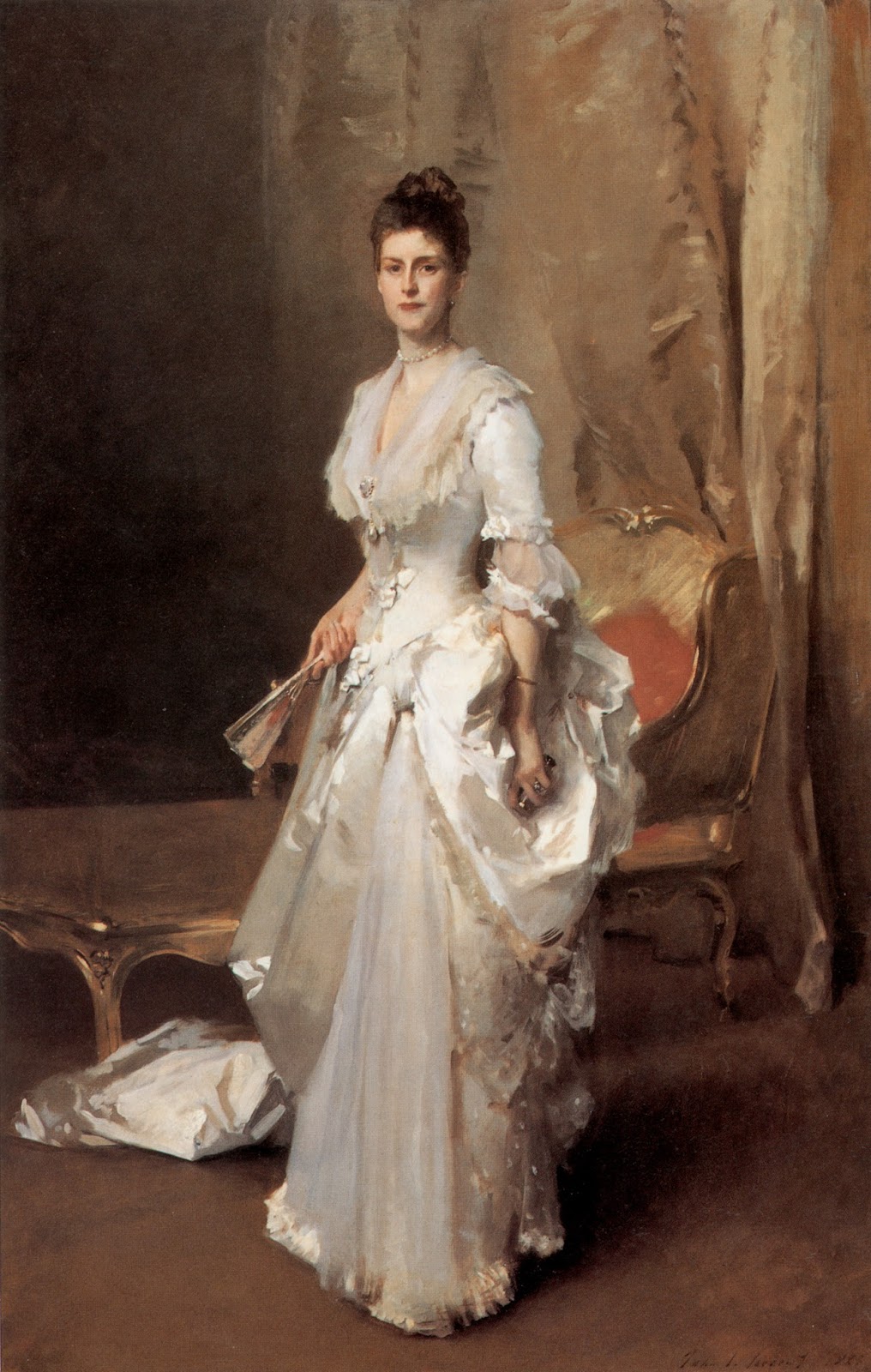
We can see how well John Singer Sargent does this in the painting below, a portrait of Mrs Henry White. So much of the dress is swirling away from direct contact with her body. This means that in order for it to look as though it belongs to her he has very few of these pressure points to work with, but these must be absolutely right. In this case the shoulders and the tight fitting waist and her hips. Her left hip indicated with a tiny little detail, a conjunction of shadow and highlight. If these were not absolutely correct, the eye of the observer would pick it up instantly and everything would look wrong.
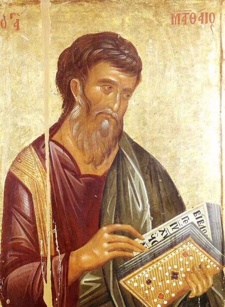
Another common area of error is in the drawing of the proportions of hands and faces. In the example below, I copied a famous icon of St Matthew. When I showed it to my teacher, Aidan, he instantly pointed out that his right hand looked distorted. I replied that I noticed this but thought that this was how it had looked in the original. Because I didn’t know if I was allowed to change it, I had left it exactly as I thought it had been done by the original artist. (I believed that when I said it, but now that I looked at it, I wonder if I copied inaccurately as well! you can see the original below and judge for yourself). Aidan immediately replied that it didn’t matter and if the original looked like that too, then the original was done badly and I should be copying errors unthinkingly. Here’s the point: just because we are working in the iconographic style it doesn’t mean that we accept anatomical inaccuracy. The goal is to be both anatomically correct and to work with the iconographic style, this is what all the great icon painters are able to do.
![]()
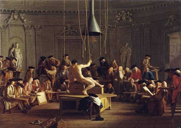
The image at the top is the Drawing Class by Sweerts (Dutch, 17th century)

In high school, my ambition was to be an artist so I took every art class offered. However, I abandoned it because I knew I could not draw (even though I took a full year of figure drawing. We drew from human models every day, but there was no actual instruction beyond, just sit down and draw). Later, I also learned I was partially color blind. Hard to be an artist when you can’t draw or see (all) the colors you are choosing!
LikeLike
It is, in my view, totally wrong and lacking in appreciation of the fantastic integrity of the sacred art of iconography to believe that ‘The goal is to be both anatomically correct and to work within the iconographic style, and this is what great icon painters are able to do.’ Icons whole raison d’etre is to show theological truths. In your interpretation of the icon of St Matthew you show the open book of the word of God as EMPTY!!!! Definitely not showing a theological truth! Figures and drapery of garments are shown as stylized and intentionally NOT NATURALISTIC or anatomically correct, just as perspective is not ‘correct’ in naturalistic terms..because icons are showing eternal truths, not people or events bound within a specific time or position. The only goal of any and particularly ‘great’ iconographers, is to show an eternal and unchanging timeless truth, preferably and most effectively using the theology and symbolism of classic iconography honed throughout the ages with scrupulous attention to theology. The naturalistic depiction of drapery is just not on this agenda.
LikeLike
Hi Madeleine, Thanks for your comment. In iconography, there is certainly a theology that governs style and I have written about this at length elsewhere, especially in my book, the Way of Beauty, or in a summarized form in a blog article linked at the bottom, called What Do Catholics Believe About Sacred Icons? Certainly the stylistic elements governed by theology modify an absolute naturalism, but that doesn’t mean that we abandon naturalism altogether, in good icons, drapery must give a sense that it folds and falls over a real person; and the anantomy must be consistent with a real person. It is the defence of the bad icon painter to say that this doesn’t matter at all. I suggest also that you read Aidan Hart’s book on icon painting, which spells this out clearly. Aidan is a highly respected painter, perhaps the leading icon painter in the English speaking world, and respected in the Orthodox and Catholic worlds. He is my teacher and I get my information from him. Secondly, in regard to your pointthat it is honed over centuries, I’m not sure exactly what you mean, but the theology of icons as we hear it today was not developed until the mid-20th century by figures such as Ouspensky and Lossky. This doesn’t make it wrong, but it is a relatively recent thing. I have not found any older sources that give the rules, such as the one that the bible must have text in it, written before that time. The iconographic tradition is not unbroken, these figures developed their theology of icons in order to reestablish what had become a degenerate style. So for example, there are no Church Father, that I have found, who articulate a theology of icons (as distinct from a theology of images as St John Damascene or St Theodore the Studite develop).
http://thewayofbeauty.org/2010/05/just-what-do-catholics-believe-about-icons/
LikeLike